Schoolhouse.world
About Schoolhouse
Schoolhouse.world was founded by Sal Khan, the creator of Khan Academy, to make high-quality tutoring free and accessible to everyone. It’s a global platform where students can receive small-group tutoring, build confidence in subjects like math and SAT prep, and connect with peers and volunteers around the world, all at no cost.
Fall 2025
My Goal
Reimagine Schoolhouse’s user experience to make learning and teaching more accessible, intuitive, and engaging. From redesigning the profile and home screens to streamlining the tutor sign-up flow, the goal was to reduce friction.
My Notes!
Still a little sad I didn’t get to meet Sal Khan (maybe one day!), but getting to work with Schoolhouse was such a rewarding experience. I did get to meet their head designer though, which was pretty awesome.
Identifying the Problem
User Statements

“I don’t want to sign up because it takes way too long”
Student @ Duke

“I can’t find what I’m looking for on this home page”
Student @ UC Berkeley

"There are too many steps that I just gave up halfway through."
Student @ University of Cincinnati
Who I was designing for
To better understand friction points in the tutor sign-up experience, I gathered insights from user interviews, survey data, and direct feedback from students at universities like Duke, UC Berkeley, and The Ohio State University. A consistent pattern emerged: users found the sign-up process too long, the homepage overwhelming, and navigation unclear. I synthesized these findings into actionable themes, which guided the design priorities: streamline steps, simplify layout, and reduce decision fatigue
Redesigning the Experience
To tackle the “too long to sign up” pain point, I restructured the tutor sign-up process into a simplified 3-step flow. Redundant fields were removed, and optional sections were visually de-emphasized to encourage completion without overwhelming users. We added progress indicators to give users a sense of advancement, and included contextual tooltips to clarify confusing sections without adding clutter.
For the homepage, I prioritized intuitive navigation and hierarchy. I redesigned the layout to emphasize key CTAs—like “Become a Tutor” and “Join as an Ambassador”—by placing them above the fold with high-contrast buttons. The new navigation bar was simplified to include only four top-level tabs, eliminating dropdown menus that previously confused users. I also reorganized informational content into clear sections with headers like "How It Works" and "Why Join," paired with icons to visually guide the user.
Old Profile Page
The original profile page was cluttered and difficult to navigate, acting more like a static landing page than a true learning hub. Key features were buried or unclear, and the overall experience felt disorganized, making it hard for users to understand where to start or what to explore next.


Old Home Page
The previous home screen lacked structure—content overlapped, visual hierarchy was missing, and users found it confusing to distinguish between class names, categories, and images. Even small details, like font treatments and image layouts, felt inconsistent and unpolished. Many users described it as chaotic and hard to trust.
New Landing Page
We took all the feedback and redesigned the interface into a clear, unified experience. Now, nothing overlaps, sections are visually organized, and users can easily explore new classes without feeling overwhelmed. The platform now feels cohesive, welcoming, and intuitive, whether you’re here to learn or teach.

Sign-Up Flow Redesign
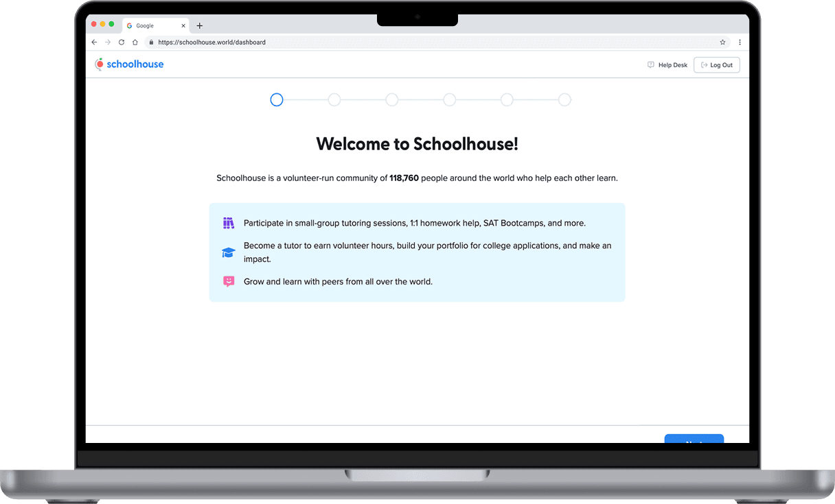
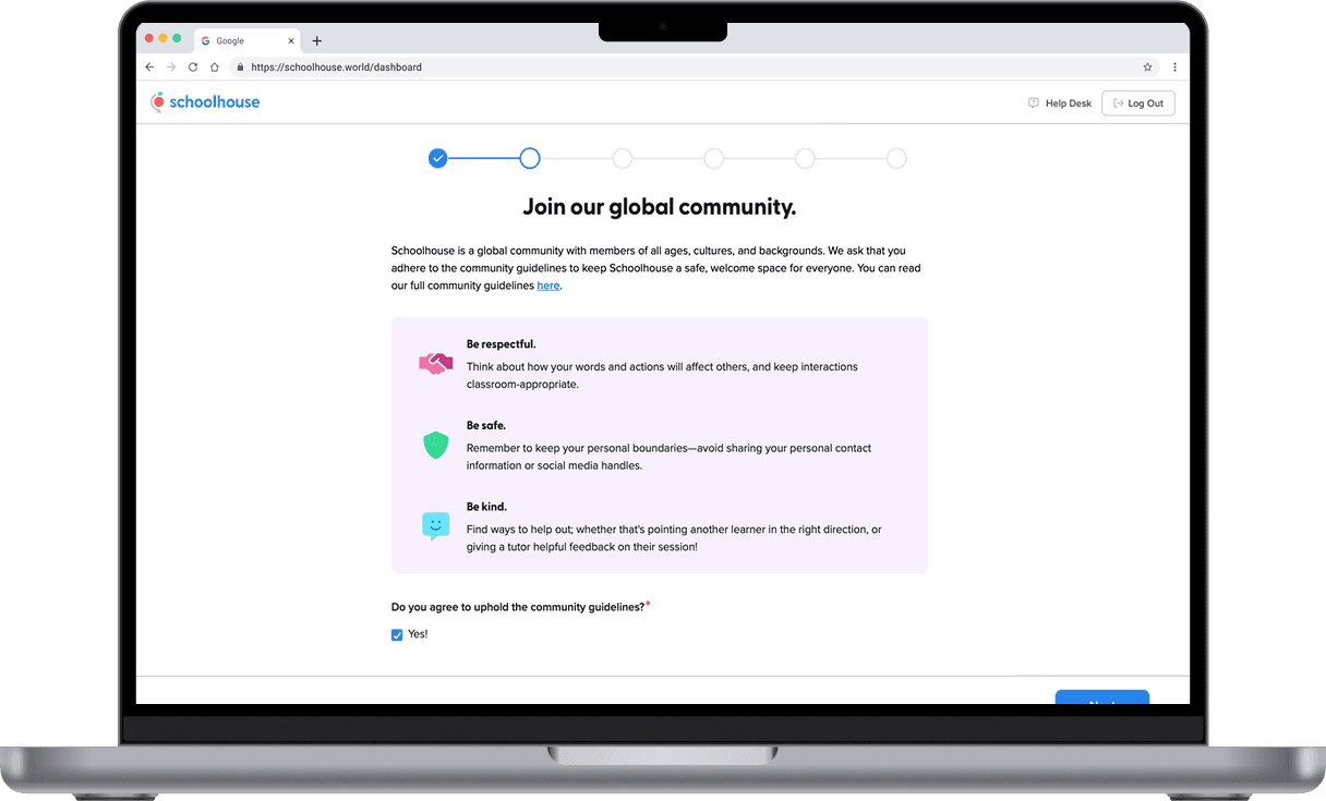
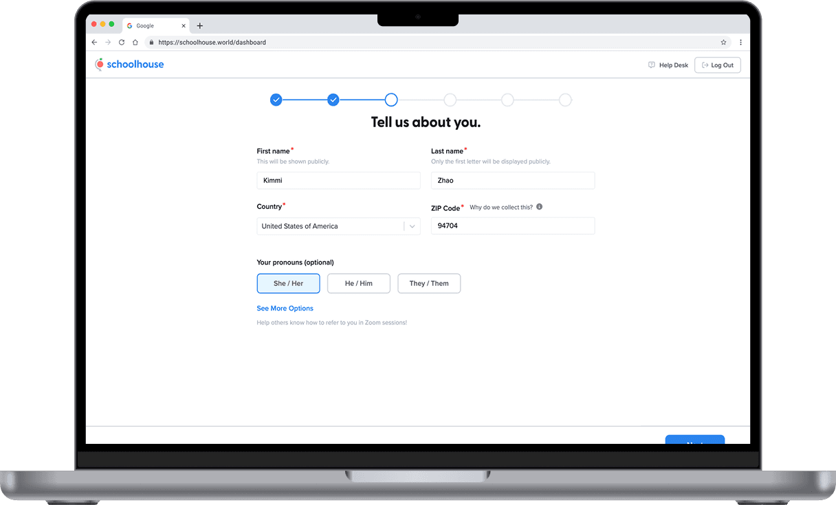
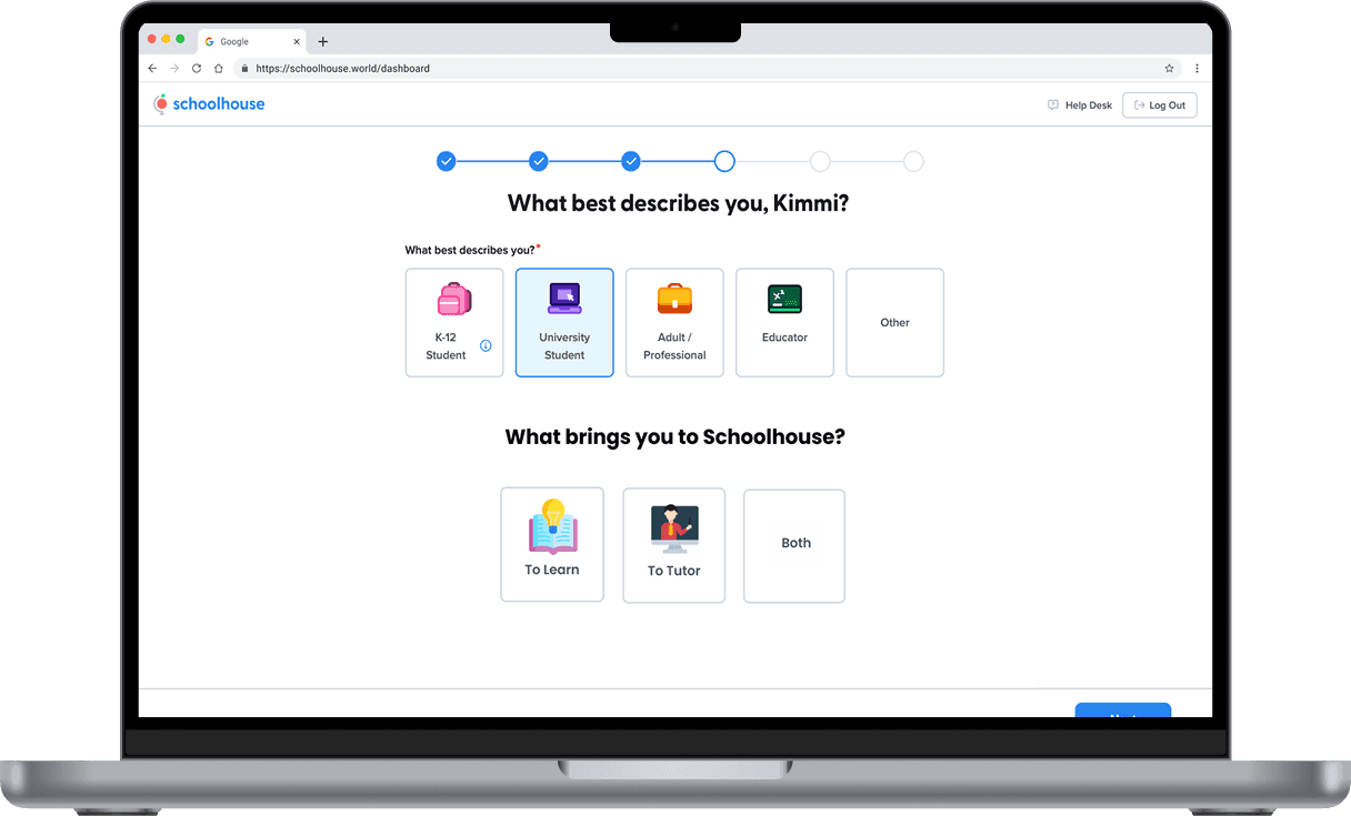
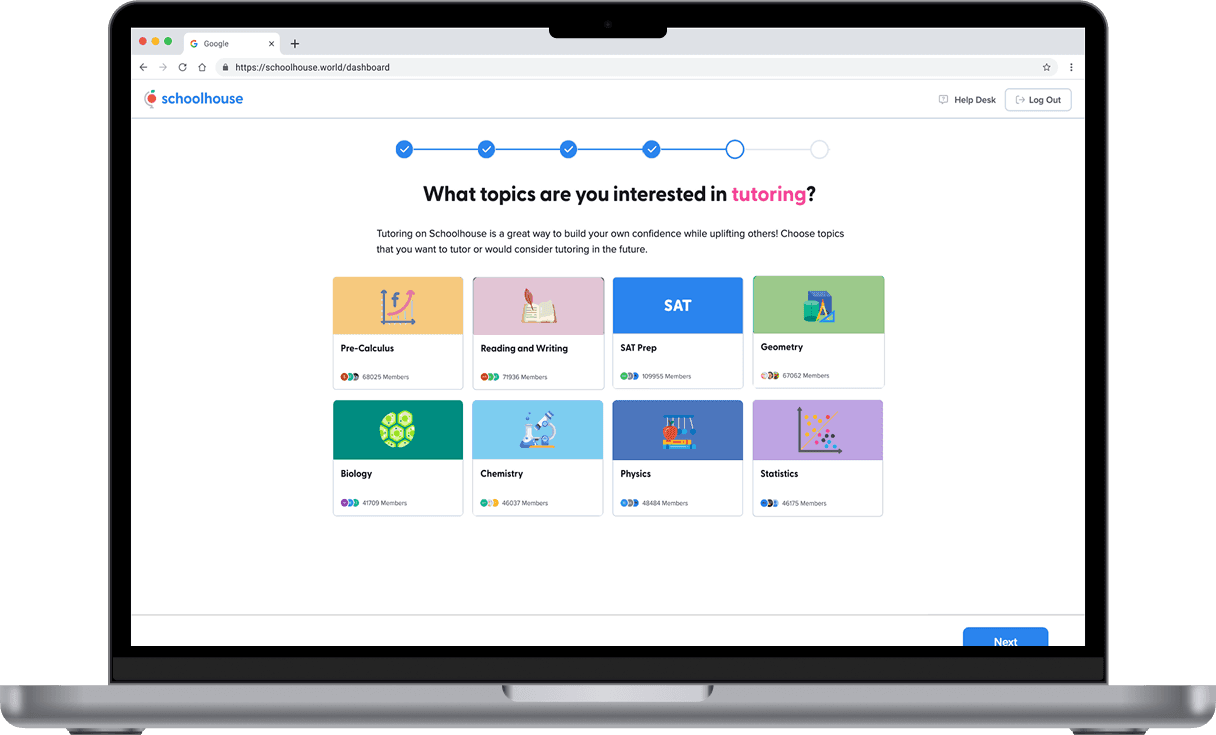
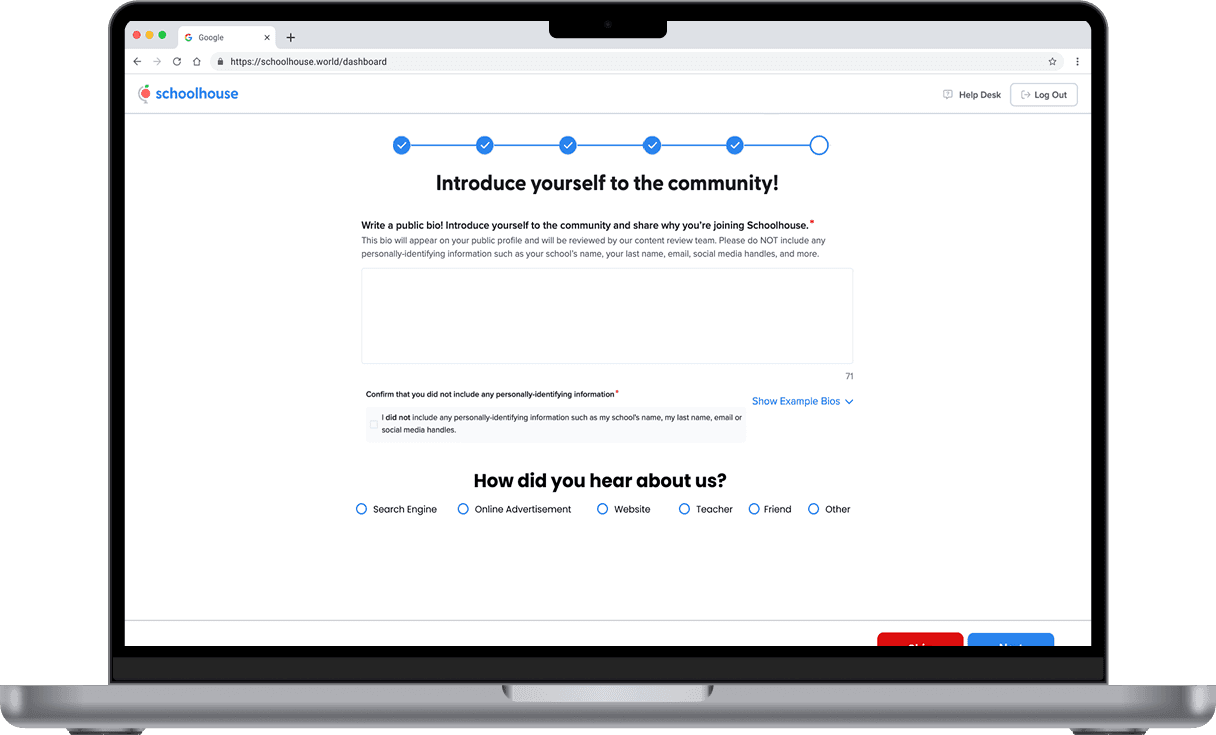
Previously, signing up to tutor on Schoolhouse could take up to an hour—a major barrier for volunteers. We completely redesigned the onboarding process, cutting down the time significantly while still preserving quality and safety standards. Now, tutors can get started faster and feel more supported every step of the way.
Reflection
Redesigns are always an interesting challenge for me because I’m constantly thinking about how to improve the user experience without sacrificing the content that matters. Working on the Schoolhouse project really pushed me to strike that balance. I had to look closely at what wasn’t working—from crammed layouts to confusing navigation—and ask myself how we could simplify things without losing the heart of what the platform offers.
It wasn’t just about making things look cleaner; it was about making it easier for students to explore, easier for tutors to sign up, and easier for everyone to feel like they belonged. I loved being able to take feedback from real users and turn it into something that felt intentional and intuitive. It reminded me how much power design holds when it’s done with empathy and clarity.
Latest
Explore More Featured Projects